Web Design
Laying Out a One-Page Website: The Section Order and Why
Part 3 of the thread Building a site for someone
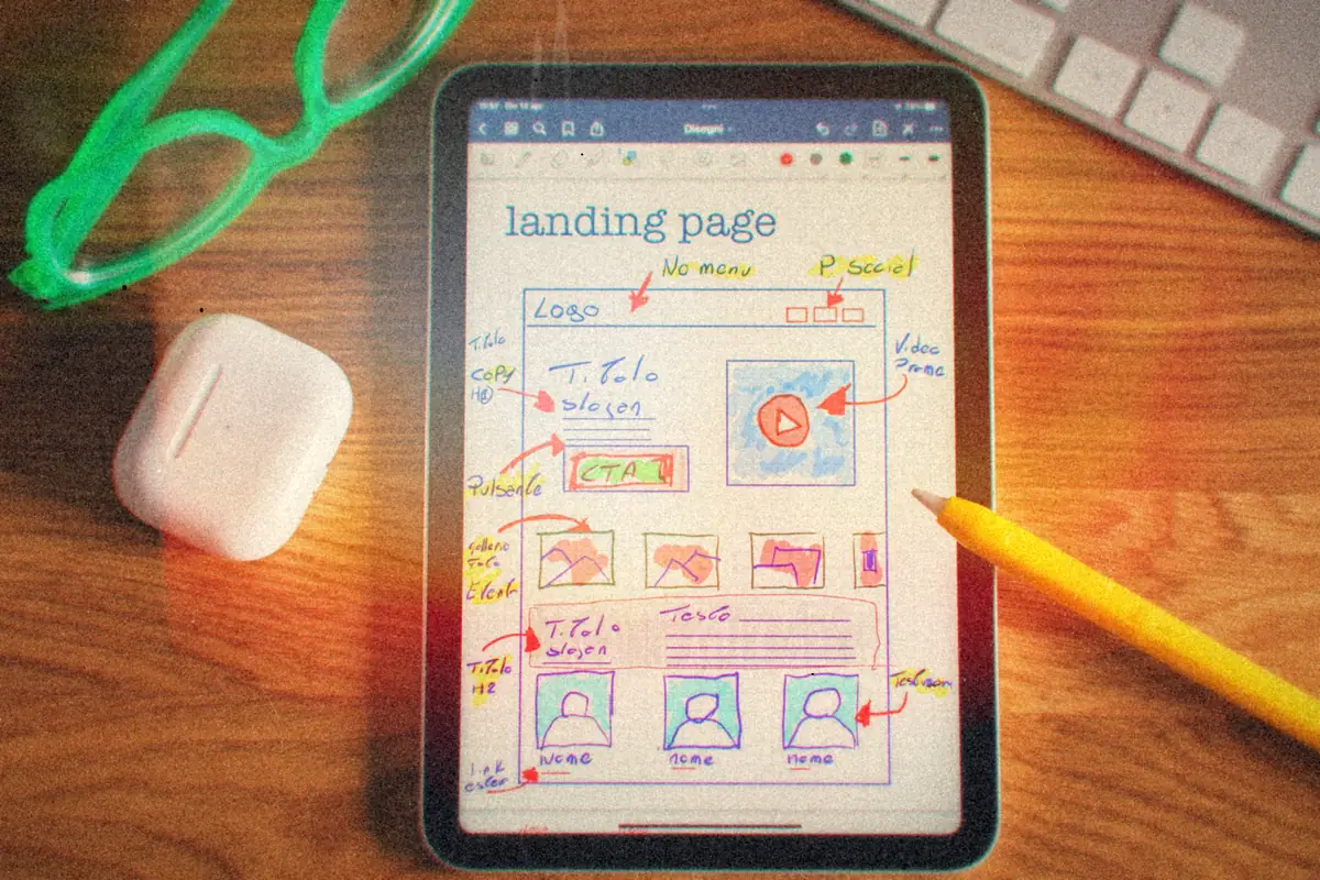
- The order: header, hero, call to action, about, services, posts, contact, footer. Shop, pricing and video are optional extras.
- Four sections are required no matter what: the hero, something current like posts, contact and the footer.
- The CTA goes right under the hero, and a smaller one can close each section after it.
- Badges linking out to social and payment sites are not calls to action. They go in the footer or header.
A lot of small businesses don't need a ten-page website. They need one page that says who they are, what they do, and how to reach them, in that order, and loads fast on a phone. I keep a layout spec for exactly that, and it's the starting point whenever the discovery answers say "one job, not much content."
The order
Header -> Hero -> CTA -> About -> Focus Areas -> Posts -> Contact -> Footer
| Section | Required? | Its job |
|---|---|---|
| Header | Yes | Name or logo, navigation, a phone number or email |
| Hero | Yes | One headline that says what you do, one line under it, one strong image |
| Call to action | Yes | The one thing you want a visitor to do next |
| About | Recommended | A short intro and a real photo. This is where trust starts. |
| Focus areas / services | Optional | Up to four blocks, one per thing you offer |
| Posts | Yes | Something current: news, recent work, reviews |
| Shop / products | Optional | A few featured items linking to the store |
| Pricing | Optional | Only if prices are simple enough to show |
| Video | Optional | One embedded video with a line of context |
| Contact | Yes | A short form (name, email, message) plus direct details |
| Footer | Yes | Secondary links, social icons, copyright, privacy |
Why the CTA goes where it does
The hero does the introducing. By the time someone's read the headline, they've either decided they're in the right place or left. The moment right after is when a clear next step works best, so the call to action sits directly under the hero, not at the bottom of the page.
My notes list options like "Explore My Portfolio," "Download My Resume" and "Contact Me for Details." Pick one. A block with four equal buttons is a menu, not a call to action.
After that, each section can close with a smaller CTA that fits it: "Start a project" under services, "Read more" under posts. That's what makes a one-page site feel like it's going somewhere as you scroll, instead of a stack of unrelated boxes.
Note
Keep the badge row separate. Links out to social profiles, payment pages, booking tools or a storefront are useful, but they send people away. They belong in the header or footer, not competing with the main button.
Rough sizes
These are starting points from my spec, not rules. The content decides the final height.
| Section | Desktop | Phone |
|---|---|---|
| Header | 1200-1400px wide, 80-120px tall | 60px tall |
| Hero | Full width, 600-800px tall | 300-400px tall |
| CTA band | 200-300px tall | 100-150px tall |
| About | 400-600px tall | 200-300px tall |
| Services | 600-800px tall | 300-400px tall |
| Posts | 800px and up | 400px and up |
| Contact | 400-600px tall | 200-300px tall |
| Footer | 100-150px tall | 80px tall |
The hero is the one to watch. What shows above the fold on a phone is often just the header and half the hero, so the headline has to be in the top part of the image, and the CTA should be visible without much of a scroll. Test it on a real phone, not a resized browser window.
Tip
Plain color backgrounds for everything except the hero and maybe services. When every section has a photo behind it, nothing stands out, including the thing you wanted people to click.
Which sections stay
Hero, posts, contact and footer are non-negotiable. A site with no way to reach anyone isn't doing its job, and a site with nothing current looks abandoned. Everything else earns its place from the discovery answers. No products, no shop section. Prices that change per job, no pricing table.
That's also where restraint helps. Designing with Vignelli's rules is my longer case for doing more with fewer elements, and it applies here: four sections done well beat nine done in a hurry. The timing side of all this is in from kickoff to launch.