Web Design
Terminal UI Components: A Pure CSS Kit for Terminal-Style Pages
Part 6 of the thread The design notebook
- What it is
- CSS framework
- My role
- Creator
- Year
- 2025
- Built with
- CSS
- HTML
- React
- Terminal windows, buttons, forms, cards, progress bars, tables and alerts, styled with class names and CSS. No JavaScript required.
- Ten color themes, switched by changing one class on
<body>. - Box-drawing characters and block glyphs do the decorating:
╔═╗frames,[████░░]progress,◢◣card corners. - It's a portfolio and demonstration project, and a few loose ends in the repo show it.
Some interfaces want to look like a terminal. Dashboards, dev tools, status pages, anything where density beats whitespace. It's the look Terminal News has for real, in an actual terminal. The usual route is to fake it with a pile of one-off styles, or drag in a JavaScript library to draw a prompt that doesn't need to do anything.
terminal-ui-components is a CSS framework for that look. You write plain HTML, add classes, pick a theme, and get something that reads like a command line without a line of JavaScript.
What's in it
The README covers the core set: terminal windows with title bars and window controls, buttons, form inputs and selects, cards, progress bars, tables and alerts. The fun part is how much of the styling comes from characters rather than images. Buttons can be drawn with double-line box characters, table headers get ┌─ PID ─┐ brackets, and progress bars are literally [██████░░░░].
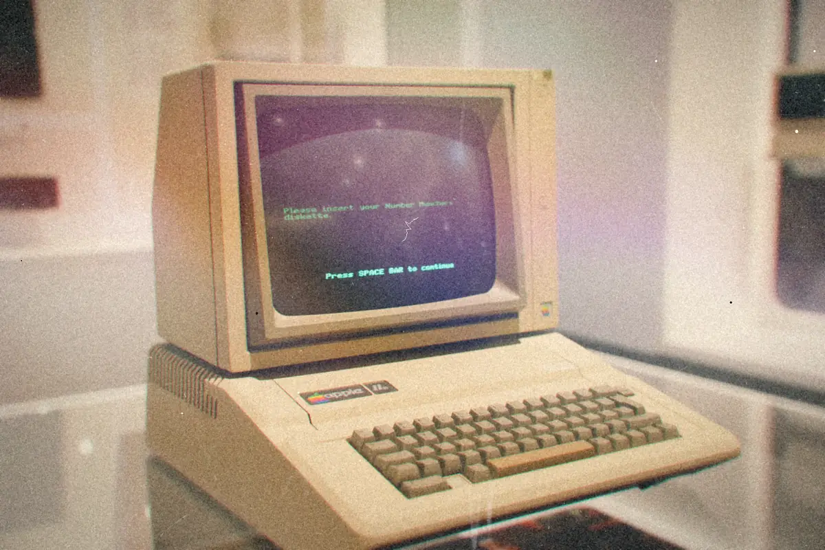
There's a separate set of geometric elements for decoration: corner pieces, ═══╡◆╞═══ dividers and shaded ░▒▓█ frames. And a handful of effects: a blinking cursor, a typewriter animation, a glitch heading, matrix rain, plus utility classes for text glow, scanlines, CRTCathode-ray tube. The deep, heavy glass TV everybody had before flat screens.More: CRT 90s TV: Channel Surfing Like It's 1996, on a Raspberry Pi flicker and pixelated images.
Themes
Theming runs on CSS variables: background, foreground, accent, font, size and line height. Switching the whole page is one class:
<body class="theme-cyberpunk">
  <!-- Your content -->
</body>
The README lists ten:
| Class | Look |
|---|---|
theme-classic |
Green on black |
theme-matrix |
Matrix green |
theme-amber |
Retro amber CRT |
theme-cyberpunk |
Neon pink and blue |
theme-dracula |
Purple palette |
theme-nord |
Arctic blue |
theme-synthwave |
'80s aesthetic |
theme-monochrome |
Black and white |
theme-solarized |
Solarized dark |
theme-custom |
Build your own |
Tip
theme-customis the escape hatch. Set--term-bg,--term-fg,--term-accent,--term-selectionand--term-cursorand you've got your own palette without touching component styles.
Everything is laid out mobile-first: a terminal window is full width on a phone, 80% from 768px up and 60% on a desktop.
Using it
Clone the repo and open the demos:
git clone https://github.com/wesellis/terminal-ui-components.git
The html-demos/ folder is the best way in. There are pages for terminal components, inputs, navigation, feedback, a file browser, image components and block visualizations, plus a component index. The package scripts include npm run serve, which just starts a local Python web server on port 8080 so you can click through them.
How it relates to Fine Use
This repo has a sibling, Fine Use, and they share a lot of files: the core CSS, the demo pages, the documentation set and a few React components. The difference is the pitch. terminal-ui-components is the CSS-first version: HTML plus classes, no framework needed. Fine Use describes itself as a React component library, adds a Python implementation, and carries a much bigger component list that its own README admits is mostly still on paper.
If you want terminal styling on a static page today, this is the one to look at.
Rough edges
The README is upfront that this is a portfolio/demonstration project, and I'd rather say where it's loose than pretend otherwise.
Heads up
The README and the repo don't fully agree yet. The quick start links a
terminal-ui.css, but the stylesheet in the tree iscomponents/css/fine-use-core.css. And the theme files inthemes/(amber, gruvbox, monokai, VT220, newspaper, sakura and others) aren't the same ten the README lists.
The package.json also describes build, lint and accessibility-test scripts that point at tooling not all present in the repo. Treat it as a well-documented kit of styles and demos, not a published package. It's MIT licensed, and contributions are welcome.